Heart of Glass
2021An ink bottle collaboration by Julia Norton and Goldie Poblador
Available in two editions of 10, one amber and one pink, each Heart of Glass ink bottle is made to order and is one of a kind due to the nuance of its handmade quality.

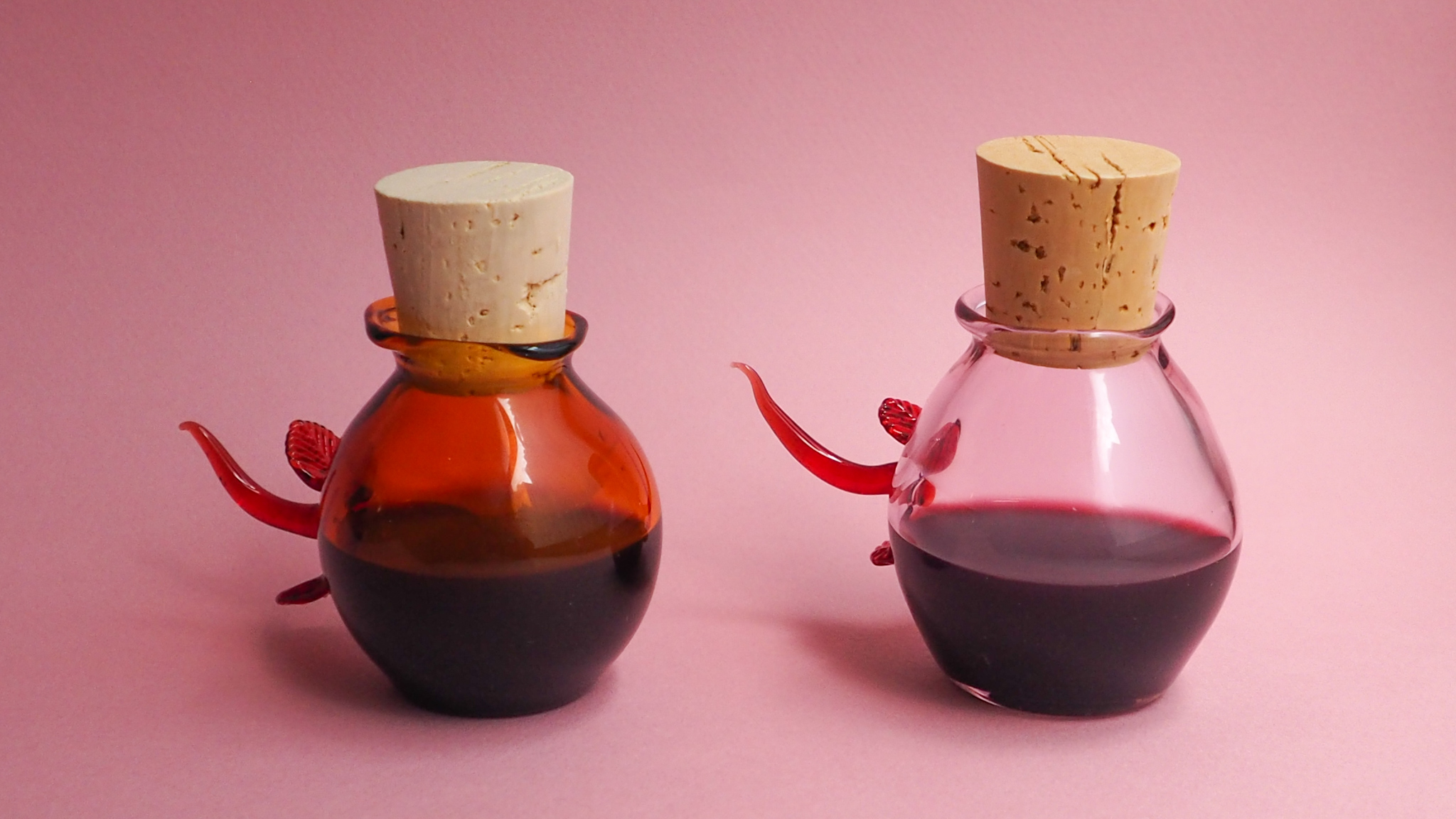

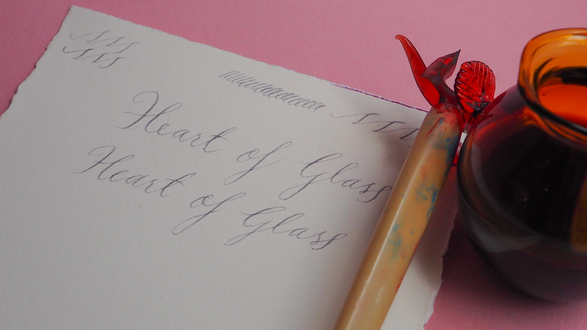
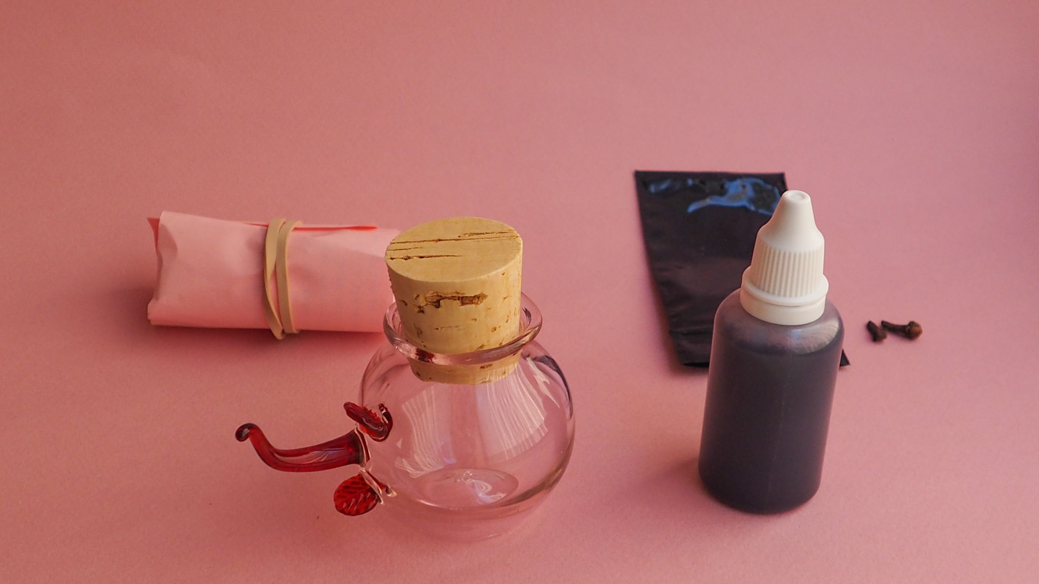


Heart of Glass - an ink by natural color material artist Julia Norton and a bottle by glass artist Goldie Poblador - is an object presented in the spirit of Valentine's Day. The ink, made from rose, hibiscus, whole cloves, and rust, will change over time in hue and saturation. This is an ink for writing love letters or diary entries, and for painting anything the heart desires. Made from natural materials that are both plant and mineral - including minerals that also exist in the human body - the ink is an art material with a lifeforce all its own. The bottle, designed and fabricated by Poblador, comes in an amber edition and a clear pink edition. Both editions feature a pen handle sculpted using a Venetian stamp tool in a transparent ruby red glass. The use of this stamp as well as the bottle’s shape speak to the Venetian tradition of glass making, yet without perfect symmetry - appearing as amorphous and organic as the ink it contains.
The project is inspired by the 1976 film of the same title, Heart of Glass directed by Werner Herzog, as well as the 1955 film Summertime starring Katharine Hepburn and directed by David Lean - two films that consider the themes of love, desire, life, and death. The thematic portrayal of transparent ruby red glass is a prominent feature in both films, and is reflected in the design of the bottle. Another influence is the 1976 installation series Signs of Love by artist Ree Morton, which displays the chaotic, and sometimes fleeting sentimentality of the kind of love that is based on a fairy tale.
Herzog’s film, a haunting tale set around 1800, centers around the glass manufacturing trade in a small Bavarian town. It is essentially a feature length visual poem about desperate longing. The object of desire, in this instance, is the secret behind the vibrant red glass that was once the local treasure. The characters long for this secret of beauty to a point that is almost vampiric - it is both sensual and disturbing, an unfulfilled and unrequited love that borders on an insatiable lust for life itself.
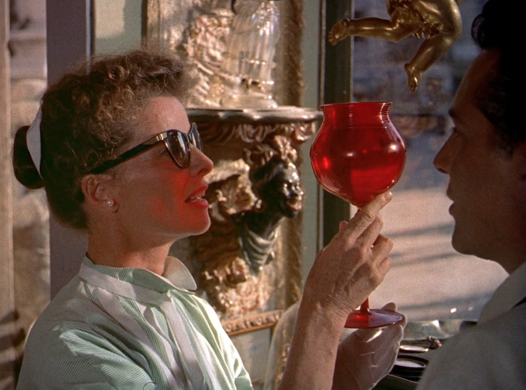
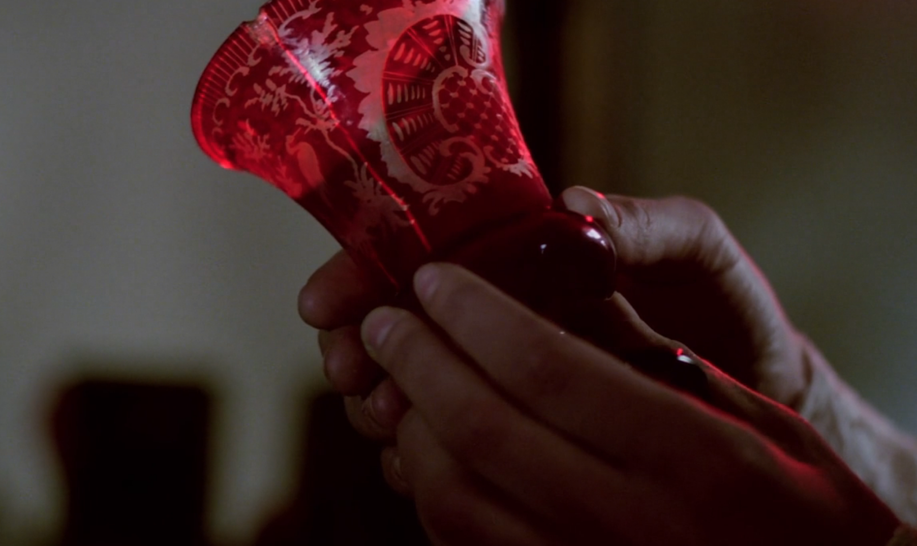
In Summertime, a film originally based on a play by Arthur Laurents, Katharine Hepburn’s character, Jane Hudson, travels to Venice, Italy for vacation. She is in her late 40s - independent with an infectious energy and spirit. After the initial joy of arrival in such a picturesque locale, Jane realizes that she is quite lonely. She eventually falls into a thrilling love affair with an antique shop owner played by Rossano Brazzi. This story is atypical for Hollywood in the mid-fifties, centering a more mature woman as the romantic lead. The film, although swelling with romance, is also laced with a palpable sadness. Gifts of gardenia flowers from her lover are lost in the canal and the train station. Jane is “past her prime” in line with the outmoded conventional appeal in Hollywood of feminine youth and beauty, and the love story is only temporary.
Venetian glass too is “past its prime”, so to speak. Jane is initially drawn to her lover’s antique shop because of a luminous red Venetian glass goblet in the window, which she purchases. The goblet, like the gardenia, is a metaphor or a synecdoche for the overpowering draw of love that threads throughout the story. It is an antique - a classic relic of the past now reduced to a souvenir.
Glass is fragile, and hearts can break, but glass was also once liquid. In this form it is malleable and fluid, able to adapt to the will of the creator. In solid form, broken glass can be mended, or recycled to create something new. The Heart of Glass project asks: Can love be reduced to a singular metaphor like a goblet, rose, or gardenia? Or can it change, grow, age, morph, strengthen or fade in hue and complexity and still remain as powerful? Perhaps, as the films Heart of Glass and Summertime allude to, the desire can overpower and lead to despair, if the intention is to keep the secret bottled and still. The point is, who are we to say what can be controlled? How can we take an antique and fabricate a new reality that is not bound by conventional constructions but is hydrous and unfixed - open to all sorts of possibilities.
Ree Morton's 1976 installation series Signs of Love, her last exhibited piece before her untimely death in 1977, presents an assemblage of objects including felt words and baroque-like Celastic sculptures that suggest an unapologetically sentimental take on love. In a Post-Minimalism Post-Pop landscape, Morton’s series was a standout for the time - a direct pivot from the predominantly male voice that spoke to industrial materials and form, or to the influence of pop culture. Signs of Love uses storybook images of flowers, swans, ladders, banners, and words like “pleasures”, “gestures”, and “moments”. It doesn’t shy away from fairytale imagery as an effective reference to drive home the personal nature of the work. It was panned for being overly sentimental on numerous occasions from its inception, as well as for being “gendered” - as if only women could relate to it. This suggestion that the personal should be overly reduced or condensed and hidden from public view is intentionally blown apart in Morton’s piece. The objects spill out from floor to ceiling, unable to be contained or recognized as anything other than referential and deeply felt.
The ink in this collaborative project cannot be controlled either. Depending on the kind of paper it is applied to it may look rosy or purple at first, but it will inevitably change over time as it dries and is exposed to the elements. It might change to a deeper purple, grey, black, or even green. The iron of the rust will take hold, deepening the color. If left in the sun, the saturation from the flowers will lighten and the chromatic hue will fade, due to the lightfastness of the ink. Regardless of its initial appearance it will always be there over however long a time period. The ink’s one constant is to make its presence known - an “ever-fixed mark”.
The vessel that holds it is sturdy yet fragile. It was once liquid itself, so it relates to its contents. Glassblowing is an alchemical transformation of liquid to solid. Each bottle is created with this process in mind, much like the ink. The bottles are created with the glass flameworking technique - a process that uses a torch to hand sculpt glass. It has been used for centuries dating back to Mesopotamian and Roman times. This type of vessel design is as related to ancient Venetian traditions of glass making as it is a reflection on glass making of the present. The amber colored edition of the object reflects a nostalgia for coke bottles or antique pharmaceutical containers. The clear pink edition is a reference to Depression era glass tchotchkes that might be found in vintage shops. As a form, the object is not perfect like a classic Venetian goblet, but why should it be? Neither are Ree Morton’s Celastic roses, or Jane Hudson’s love affair.
︎ click here for a peek behind the scenes
︎ click here to order

top photo by JL Javier, 2024
bottom photo by
Anna Frumenti, 2021
︎︎︎Curriculum Vitae
︎︎︎Artist Statement
Email goldiepoblador@gmail.com for inquiries
Goldie Poblador is a visual artist who merges glass sculpture, performance, and video into multi-sensory installations that address themes of climate change and the emancipation of the female body.
Artist Biography
Goldie Poblador is a Filipina visual artist who creates multi-sensory installations that merge glass scent, sound and performance that address themes of ecology and decolonization as it relates to the emancipation of the female body.
Her work has been exhibited and performed internationally at such institutions as Artpace, The Corning Museum of Glass, Urban Glass, 601Artspace, The Knockdown Center, Saudi National Museum, The Rubin Museum, Singapore Art Museum, Bangkok Art and Culture Center, Fine Art Museum of Hanoi, Lopez Memorial Museum, Art Fair Philippines, Metropolitan Museum of Manila, The National Museum of the Filipino People and The Cultural Center of the Philippines.
She is the first Filipino artist to be acquired by the Corning Museum of Glass. She has received grants from the Foundation of Contemporary Arts, the University of the Philippines, the Puffin Foundation and a President’s Scholarship from the Rhode Island School of Design. She has completed residencies at Artpace, the Corning Museum of Glass, Oakspring Garden Foundation, MASS MoCa, and the Cité International des Arts. She received her BFA in Studio Arts from the University of the Philippines in 2009. In 2015, she obtained her MFA in Glass at the Rhode Island School of Design.
Registered as Goldieland Studio / New York, NY